Domino’s Pizza Inc. is rolling out its first major rebrand in 13 years, updating everything from its logo and packaging to store designs and employee uniforms.
The company says the refresh draws on its past and present whilst aiming to modernise the brand for new customers.
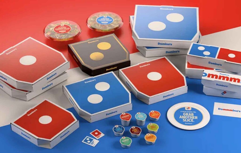
Changes include a new jingle built around the Domino’s name, recorded with musician Shaboozey, and redesigned pizza boxes that feature brighter colours and simplified graphics.
Domino’s menu items like pan and stuffed-crust pizzas will come in black-and-gold boxes.
It has also adjusted its trademark red and blue to hotter tones and introduced a thicker custom typeface called “Domino’s Sans.”
Updates will also appear on its website, app, and marketing materials.
The new look and feel will roll out over the coming months across the US and multiple international markets.
In an official press release Kate Trumbull, Domino’s executive Vice-President said: “Over the past decade, we became known as a technology company that happens to sell pizza
But with our Hungry for more strategy, we’re bringing the focus back to making and delivering the most delicious products and experience, which is what Domino’s customers really want.
Rather than launching a more traditional tagline, we’re baking craveability right into our name and every aspect of our brand as a reminder of this relentless focus.”